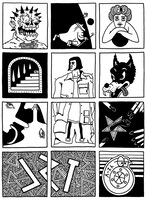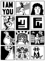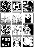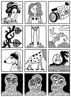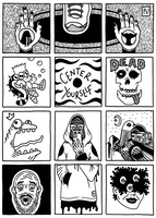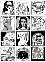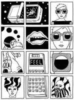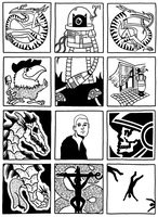
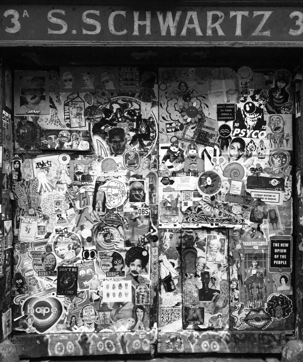
but before [all that] – before i met dillon, and before i sat stoned in the park watching people people watching and watching people painting walls, i found and photographed the stickers that make up the ninety-six panels of my eight-part stickers from london set, which i finished, finally, a few days ago.
and before i do what i normally do, and move on, without comment, i want to put down here, and now, a few words about panes. what they are, and why they are, and why they are what they are. here goes nothing.
a few words about panes.
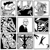
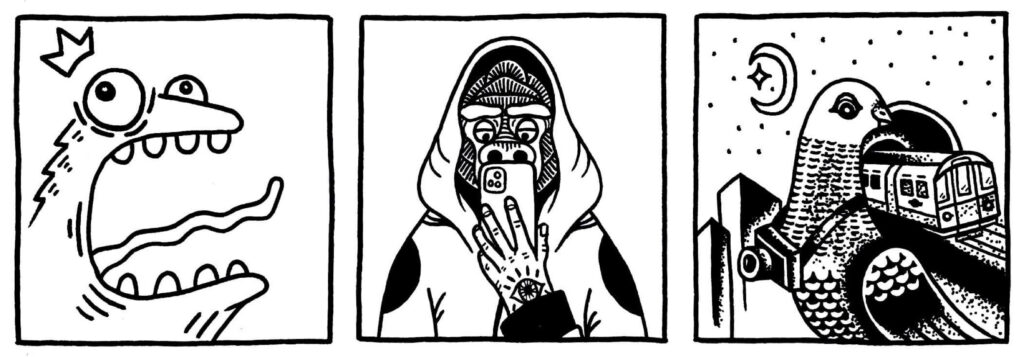
panes are what i call my twelve-panel street-art slash sticker-bomb sets. pane as in windowpane. a framing device. something you look into, or out of, or through. windowpane as in acid, as in lsd. as in issue six of charles burns’ magnum opus black hole. and as in pain. y’know – physical, mental.
panes are above all a paean to street art. to anarchy. to colouring in. to the criminal beautification of the urban realm. to the radical realisation that there’s more to big city life than pigeon shit and shit adverts. panes are both a self-portrait, and a portrait of the street as i see it.
panes are my attempt to document the momentary, and to it mould in my own image. to draw permanent marker moustaches on the magazine faces. to throw metaphorical half-bricks through metaphorical windows. to put things in boxes. to smash capitalism, and to immanetize the eschaton. all that good shit.
panes are my vision of the world as it is, and as it ought to be.
panes are my mostly-wordless aesthetic manifesto.
i started drawing because i stopped wanting to write. i stopped wanting to write, so i stopped writing. i’d been depressed for so long, and writing had been, for so long, my way of dealing with depression, that it became difficult to write with any sense of freedom, or fun. what once had been effortless sun-kissed self-expression, became hard labour, heavy lifting in the pissing rain. became the unthinkable, became work.
writing came with expectations. with shoulds. writing should be effortless. should be simplicity itself. should be the freewheelin’ bob dylan. but it wasn’t.
drawing, on the other hand, didn’t come with any expectations. drawing was new. drawing was different. drawing was something to do while i waited to start wanting to write again. to start with.
i soon realised that drawing offered more than just the perfect placeholder. drawing didn’t just allow me to say the things that i’d become unable or unwilling to say with words, but to say things that were entirely new and different in an entirely new and different way.
and what do panes say?
they say:
i love being alive
they say:
sometimes i hate it
but sometimes i don’t
that being said, i don’t think that they mean anything. or at least, not any one thing. the process of making them means something, to me, and maybe that somehow bleeds through, and sinks, inkily into the finished artwork. a hidden meaning that’s not there, but there, real, but not – like a contact high.
and collectively, of course, they represent something. to me, they represent everything. but i don’t sit deliberately down at my desk with the intention to create something with a specific meaning. if i have any intention at all, it’s to create an aesthetic. to create the sort of art that i want to put up on my own walls. the sort of art i want to surround myself with. it’s by me, and for me, and if anyone else likes it, i suppose that means that i have good taste, or they have good taste, or we both have bad taste.
so let’s call it art.
what makes my art my art?
at what point does my art become my art, and not say, a glorified online gallery of other people’s art?
in the end, it’s not for me to say, one way or the other. but here are my thoughts.
i think it has something to do with intention, and something to do with execution. why i do what i do, and how i do it. if my aim was just to show off cool street art, i’d buy a better camera, move to a berlin squat, and start a street art blog. or a podcast. it’s not. and if my method was just to take moody monochrome street art photos off pinterest and put them in a grid, there’s no way i could claim the result as mine. but it’s not that either.
this project (let’s call it a project) is about documenting, but also modifying. making mine. making my own. translating. mutating, transmuting, transforming in my bed into a monstrous bedbug. transmogrifying. reworking, remaking. defining, refining, redefining, rerefining. reifying.
fine, but what makes it mine?
well, all of it. all of it, or none of it.
what my art art, makes it mine.
my creative process is essentially a series of conscious and unconscious choices, plus chaos. the introduction of chaos into my work is itself a conscious choice. other choices, or opportunities to make choices include: finding and choosing the individual images, choosing how to combine and arrange the images, and choosing how to render each piece – what to keep the same, what to change, what to simplify, what to embellish. how to use details, textures, contrast, text, and ma. more on that later.
my work looks the way it does because of these choices. these choices represent who i am. these choices represent me.
what makes this art my art, then, is the sum total of all these choices, and the chaotically-inflected manifestations of these choices. that, plus style mother fucker.
weed got me here
weed and talent
and natural effortless flow
and style
mother fucker
and mad ambition
fieldwork:
i begin by going out and finding interesting images. going out and finding. every single sticker in every single set is a sticker that i’ve seen, in situ, on the street.
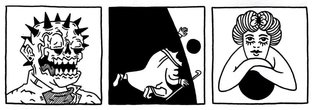
if i had a sticker type, it’d be something that looks like it crawled out of a charles burns comic. clean, bold linework. tattoo flash aesthetic. eyes. eye sockets. skulls. something weird. something warped, or deformed. something not quite right. something nsfw. something surreal or suggestive or subversive. i like stuff that stands out. stuff that’s funny. or offensive. i like words.
without this step the whole thing would be boring and pointless. i mean that. boring, and pointless. and non-existent. this project is as much about walking as it is about drawing. it’s even more about noticing. about finding significance in the seemingly insignificant, importance in the purportedly unimportant, and in the small, all.
it has completely changed the way i look at urban environments. the way you look affects what you see, and once you’ve seen something, it affects the way you look (and so on ad infinitum). if you’re looking for stickers, you see stickers. if you’re looking for beauty, you see beauty. i see stickers, and beauty, everywhere.
– Do you always look at it encoded?
The Matrix (1999)
– You get used to it. I don’t even see the code. All I see is blonde, brunette, red-head.
deskwork:
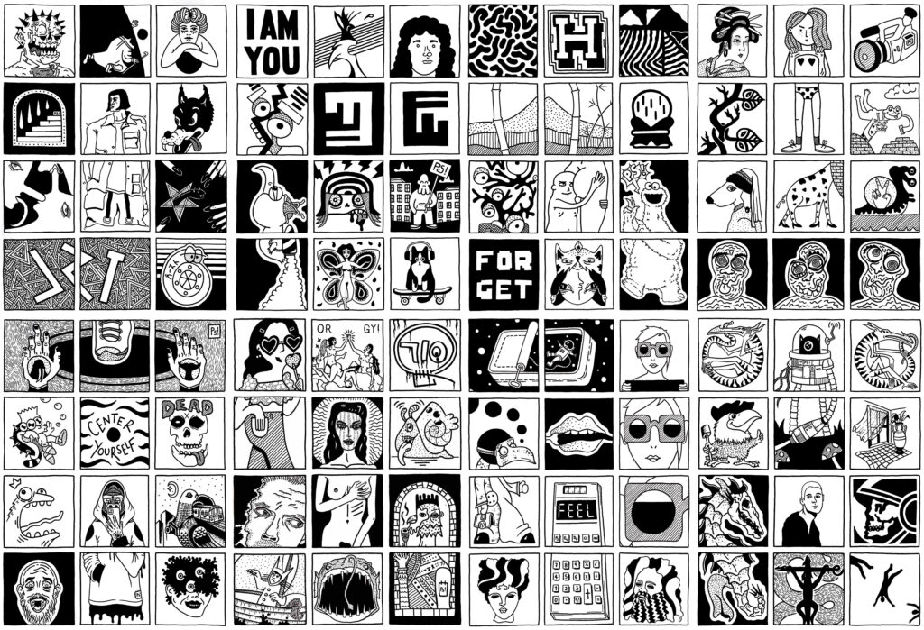
a successful set, a set that works, that sings, for me, is one that’s interesting, beautiful, balanced, and in some definite yet indefinable way, more than the sum of its parts. my favourite sets are those that somehow seem to cohere into abstract, non-linear, darkly-comic comic strips, with panels that ambiguously interact with, or pointedly ignore each other. in other words, my favourite pieces have a sense of humour.
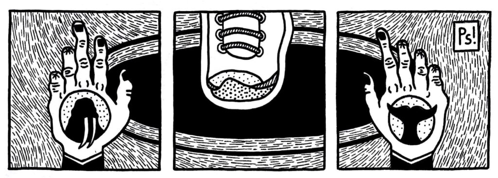
i start small. stickers and a piece of a5 cartridge divided into a dozen squares. four rows and three columns. i think, without this grid, i’d never get started. it’s the initial and unvarying state of order, from and within which controlled chaos can emerge. the sea, the sea. this grid is the unchoice that defines everything that follows.
next, i choose which images to use, and where to put them. mostly this is intuition and experience and random guessing about what might work. i try, more or less consciously, to include certain elements within each set. the aim here is balance. balance between primarily light and dark panels, between complex and simple images, between a clean and highly-textured aesthetic. i also like to include at least one image with prominent text. i aim for a relaxed sort of symmetry.
once i know where they’re going, i sketch the images in pencil, then go over in fineliner. a lot of what makes my art look like my art starts at this point. adding detail, texture, and contrast.
detail:
these pieces take a long time to make. a long fucking time. mostly that’s because i’m slow, and bad at drawing, but also because i like drawing really small things with really small pens. which generally looks great. however, too much detail can create the effect of visual clutter. sometimes what looks great for an individual image can become messy when multiplied by twelve.
that said, just as each piece is the combination of many individual images, i see them as existing as part of something bigger, and in that context, pieces that on their own seem too busy, or too sparse, can combine with others to form a more balanced whole.
texture:
texture, for me, is like colour. in a way, is colour. different textures represent different colours, and adding texture is like colouring in. and life is the colouring in. texture gives the piece life. it gives it visual richness and a feeling of depth. you can make something slimy, silky, smooth, cold, flowing, luxurious, reflective, dirty, wet, feathery, prickly, wrinkly, coarse, or metallic. it’s crazy what you can do with a few dots or lines.
and while too much detail can create visual clutter, texture actually reduces visual clutter, since our brains use these textures as a mental map-key to figure out what’s going on – what’s what and what’s not.
contrast:
contrast, to me, is yin and yang. the warp and the weft. being and non-being. the balance, not just between black and white, highlights and shadow, but also between fine and bold lines, between intricate detail and simplicity. generally, i like high-contrast. if the piece has something to say, i want it to shout it. from the rooftops. through a megaphone. naked. while wearing rollerblades. fuck subtlety.
If you awaken from this illusion and you understand that black implies white, self implies other, life implies death (or shall I say death implies life?), you can feel yourself – not as a stranger in the world, not as something here on probation, not as something that has arrived here by fluke – but you can begin to feel your own existence as absolutely fundamental.
Alan Watts
ma:
finally, one thing i try to include is some element of space. not just blank space, but breathing space – something like the japanese concept of ma. [this article] about ma is really interesting and explains the pictographical etymology of the kanji symbol for ma, ‘a door through the crevice of which the sunlight peeps in’.
ma is ‘the time and space life needs to breathe, to feel and connect.’ the godfather of japanese animation, hayao miyazaki, incorporates ma into all his movies, and he’s pretty good at this shit.
a note on credits
i try to credit everything i use. however, some stickers or paste-ups are nameless to begin with, or time and the accelerated entropy of the outdoor environment eventually renders them anonymous. sometimes names are covered over, or gone completely. in these cases, i credit as a question mark. that way, there’s no ambiguity between credited or uncredited images, and my own, original images, which are credited as pseudo.
i hope, in this way, that you too, as i have, can find inspiration in the individual pieces that speak to you. happy hunting!